You are using an out of date browser. It may not display this or other websites correctly.
You should upgrade or use an alternative browser.
You should upgrade or use an alternative browser.
home page looked better before
- Thread starter Klyern
- Start date

Ad: Buy Girls Und Panzer Merch from Play Asia!
Well it's because daft-sama wanted to try and change the front page look since it's been the same old same old for quite some time it would seem. So he pretty much was testing it out on the FTV Members and maybe on the Sempais as well.
The only problem I have with it as of now is that the whole thing that was supposed to be posted on the front page is missing a few things though. I just hope that gets fixed though.
The only problem I have with it as of now is that the whole thing that was supposed to be posted on the front page is missing a few things though. I just hope that gets fixed though.
I am sure it will all get sorted out...eye pleasing aesthetics all take time. Good input is currently being considered and further tinkering may be required before most are in agreement and anything is finalized. In the meantime, don't let the changes scare you, Klyern-chan, just ask for help and someone will gladly oblige you.

QUOTE (Klyern @ Apr 10 2011, 10:22 PM) I dont know if im the only one but i think the dispossition of links etc looked better before, and was easier to use.
Did something happened while updating the page? idk if this is temporal or not but it scares me seeing the page like this xD.
Hi Klyern,
I understand your concern - old interfaces can often be easier to use than new ones. A lot of the times, changing the layout of commonly used features may cause some initial confusion, but hopefully with a short adjustment period, you'll find that the new design is even easier to use than the last.
Sometimes things can be broken or missing though; if you find something, just mention it and I'll see what I can do to the new design to make it work better. Although not everything makes it to the final version, everything is considered.
I apppreciate the effort and every second Daft invested into making FTV a better place, but I must agree that the page looked better before.
My concern is, that when somebody new comes to FTV, the first thing that will be displayed in his browser is: 1) comercials on the top, 2) FTV logo that takes up too much space, 3) genres sections that are unstructured and looked a bit random AND he/she needs to scroll waaaaaay down to actually see the animes FTV offers.
I am really sorrry to say this, but I am afraid that this new layout is going to kill the interest of any potential new member.
Also the forums dont really look like forums any more, there are no sections, it is unstructured and this will reduce the number of posts people make even more.
Please Daft dont take this the wrong way, i REAALY appreciate your effort. But this is not better than before.
I suggest we put then forums, blogs, etc againt to the right side (or left, it doesnt really matter) and put some more structure into it and also use some buttons or at least make it look friendlier than "entry style".
Actually I took a look at what it looks like when logged out, and it has the same old setup before the change. When you're logged in it has the new setup. I think daft-sama is doing a beta test on the rest of the users to see what thier opinion is as of now.
Well, I don't know if this is the final design so maybe I am jumping the gun here but from what I currently see, I must agree with Klyern that the new design is not as good the previous version.
In this current design the logo position is too prominent and most importantly is in a prime location. If a person finds FTV through google or other search engine my concern is they are going to see a bunch of links, a flashing gif logo, an advert and think it is some kind of spam site. It should be more obvious that this site is an anime download site and this should be obvious when seeing the page for the first 3 seconds. This I feel is critical because people form an first impression that quickly when first clicking onto the website from a search engine. If they cannot guess what the site's purpose is immediately, or worse, they think it is a spam/useless site they will leave. Me personally, I don't think it is immediately obvious when first glancing the websites what FTV is. You must scroll down further to even guess this is a anime download site.
Now I can understand, and appreciate, the time taken to make this design but if the ultimate purpose is to attract new viewers then I have large doubts this design will achieve that objective. On the contrary, I believe it will do just the opposite.
Haven't read the thread, but here's my take.
I love the idea to change the main page, I was actually going to post a suggestion thread about the necessity to do so. And frankly, the main page is not so far away from what I had in mind, but there's a few issues with it:
1. Overall impression - looks too much like a blog, too little like an anime website.
2. I'm not sure how big yall's screens are, but on my fairly small 1360x768 monitor the main page takes up maybe half the screen in width, too much space wasted. I would suggest re-designing somehow to make more efficient use of space.
3. I've talked to a few of my friends who lurk the site, and we all agree that the first thing one needs to see on an anime site is anime. As is right now, half the screen is taken up by the ad banner and Fansub banner, the rest by the announcement. You need to scroll down 1-1.5 screens to get to the anime. The new episodes should definitely be on top. Announcements/forum links could either go below, or elsewhere.
4. One way to solve problems #2 and #3 is to move ads to the sides of the screen. Not the perfect solution but it works (see Animetake's from page).
5. Stylistically there's a bit of mismatch b/w main, anime and forum pages.
6. Misc layout musings:
-IMO "browse genre" bar isn't the most important thing in the world to be on the very top of the page. Either move it to the sites, or have it be on top of the "anime" page but not main page.
- Announcement should take up less space. Considering that most of the time it is simply a recommended show or a random Youtube video, it's not that important - not something a visitor should see as soon as they arrive.
- I like the color-coded links for anime/forum/blog. Love the idea. I kind of dislike the fact that the forum links are no longer divided by forum. I also don't think it's necessary to have latest episodes both as text links and as screenshot links. Can be reworked a bit, though don't have a specific idea atm.
- The most important top bar (the one with links for everything and account controls) gets lost between the ad and the site banner. It needs to be made much bigger, and/or moved below the site banner.
Ideally I'd like to see layout like this:
-Fansub.TV Banner
-Main links/User CP enlarged (taking the space of "genres")
-Anime episodes (get rid of the one giant screenshot and just have a few smaller ones as before) - this would take the space of the "announcement" panel"
This would leave a few inches of space on the one screen where you could put forum links, and/or a smaller announcement bar. Alternatively, have episode icons taper off to one side so you can scroll down to see more, while lining up something else on the other side (e.g. ads, forum links etc).
Random suggestion: IMO we should use a representative screenshot/picture (or a few) for the series icons instead of random screens. While it works sometimes, anywhere 40-60% of the time the random screenshot shows an empty wall, sky shot etc. something that doesn't draw your attention or allow you to recognize what you're looking for.
BOTTOM LINE: Please do continue working on it. I love the new design and its slick look, and the change has been long overdue anyway. But, I hope some of these suggestion can be helpful to improving the site.
-Aus

I kind of get this feeling that the layout is ok, but for some reason I kind of think that the Forums should be on the right corner along with the blogs, and the anime stuff on the left side like before. I mean that way aside form what we want to show on the front page and the anime series that were released can be shown near each other. I mean it frees up a space to bring the anime closer to the top of the page. As for the banner it has to be on the very top since it shows were you are, as for the ad up top well, you'll figgure something out daft-sama.

Well in any case there is a good ammount of white on both sides so it looks like yo ucan do something with that, but like I said it's up to you on that daft-sama.
Also, I remeber that if you clicked on your user name it would direct you to your profile info, I kind of miss doing that as of now once I loog-in. I only do that to make sure that my avy and sig look alright before I traverse on the forums.
The current beta test period for the page has ended. It will probably start up again later in the evening today. If you'd like to see the old page again, it's currently available at http://www.fansub.tv/index3.php
Was kinda late with my reply since I was editing the screenshots of the new page, but this is what the layout should be more like in my eyes (a rough work but the general idea is there):
I understand that its better for the ads to be higher up and stuff but then either the announcement\placeholder should be removed (possibly redesigned) or left at top with a script redirecting to an anchor at the cp panel level, in order to clear some space and focus the visitors to the content they are looking for.
I'm kind of 50\50 concerning the bigger version the latest episode screenshot since it fits in with the episode download pages' layout, and looks nice, but it does eat up a lot of space after all.
I really support Ausdoerrt-sans idea of having the episode icons taper off to one side of the screen, though haven't included that into my image:
QUOTE Alternatively, have episode icons taper off to one side so you can scroll down to see more, while lining up something else on the other side (e.g. ads, forum links etc).
I also dislike the new design of the "Anime\Topics\Blogs links". Even though color-coded. they looked too much like the AdBrite advert xD
QUOTE (Nioki @ Apr 11 2011, 07:56 AM) I also dislike the new design of the "Anime\Topics\Blogs links". Even though color-coded. they looked too much like the AdBrite advert xD
They look like journal entries..... I think some minimal structure in the Forums should be there. I would go for 3 sections as minimum: anime, manga, general
Also the style could also look a little friendlier to the eye

They look like journal entries..... I think some minimal structure in the Forums should be there. I would go for 3 sections as minimum: anime, manga, general
Also the style could also look a little friendlier to the eye
Like the others, I also appreciate that you are working hard to make the front page better daft, but here is some more constructive criticism:
-background is too white! might look better with some more color
-the latest episode added, which right now is Yondemasu yo, Azazel-san or whatever looks weird with random screenshots in that HUGE picture frame. I like Ausdo's idea of using one representative image from the anime for the newly added episodes. Sometimes with the random screenshots its hard to tell at first glance what the anime is.

Looks kinda ridiculous with that HUGE BURGER in the screenshot
lol
-otherwise I don't have many other suggestions that haven't already been said, right now it does look more like a blog than an anime community and download site which is the main concern.
-background is too white! might look better with some more color
-the latest episode added, which right now is Yondemasu yo, Azazel-san or whatever looks weird with random screenshots in that HUGE picture frame. I like Ausdo's idea of using one representative image from the anime for the newly added episodes. Sometimes with the random screenshots its hard to tell at first glance what the anime is.

Looks kinda ridiculous with that HUGE BURGER in the screenshot
-otherwise I don't have many other suggestions that haven't already been said, right now it does look more like a blog than an anime community and download site which is the main concern.
Ah, so cool and wonderful. It gives such a great thrill whenever you see a change you asked for happen. And I've been refreshing constantly as I usually do and have seen such cool changes every some hours. Thanks Daft-sama, for making my favorite website even cooler. And I can't believe the versatility of that banner. It worked out through the old design and looks even cooler here.
Now looking through the past suggestions, I love basically all of Ausdoerrt-sama's suggestions. It seems the problem with showing off the site to new members is that you must see how to get anime at first glance to attract them. If you had moved the ads to the sides, it wouldn't be intruding and you'd be able to see the "Browse Anime" part. But I don't see this as a workable solution. It's just hard to design with html to have the sides of the website filled 100% and isn't done often. Most websites have this blank space on the side just filled with color. The eye is more sensitive to luma (bright/dark) over chroma (color) so why not make the unused background on the sides a dull color? Maybe very, very light grey that matches with the shadow theme?
I personally don't have an issue with the ad positioning, as it keeps most of the website intact. But to see some sort of anime on the front page without scrolling while still having the ads on top, how about:
1.) switching the area with the "blogs" with the "browse anime"? This would allow you to read the whole blog title, author, blog name, comments. or,
2.) Leave the Feature (currently the sendai earthquake) but move the forums and blogs below the feature and switch it with a 2x2 blocks of anime so people can see the latest anime when they first load the website?
I'm guessing you've already tested out a few formats, though...
Also for the "Browse Anime," instead of having the "All" in the list of genres, how about making simply clicking "Browse Anime" give you the list of all anime. the All button is the same as the anime page anyways.
I'm not sure of the next two things myself but just to put it in a suggestion because they'd be a big change and may take a lot of work... many sites now have a featured area where things scroll from picture to picture. Sort of like how crunchyroll or sugoidesu have it. Except to have this for the site's feature (currently the sendai earthquake). This would add more to the regularity of the feature, size-wise. Although it would require pics to be a certain pixel size. I personally find it annoying for these things to scroll from one to the next in timings, though, and would click through them instead. Another odd suggestion I'm not too sure of is to make the anime on the front page like the image search on Bing.
Or just keep it the new classic Fansub.tv
The new design is really starting to take shape.
I like the new smaller "Feature" area with the Forums and Blogs to the side. However, I liked the old "Popular Shows" and think that it could be included again. I also think the preview text after the thread title is unneeded. It does little to add to the page and takes up a lot of space. Instead, I think that space could be used to show more thread titles, maybe in 2 columns, and break it down into more categories.
I also like the Browse Anime section layout. The widescreen previews and the ad placement works well.
It would also be nice to move the top ad to the bottom of the page, much like Nioki had in the preview photo. Though I understand why an ad at the top is important.
A more unified look throughout the rest of the site would also be nice, but that can come later.
Thanks for all your hard work Daft
Getting better. I would still have announcements/forum and anime episodes switch places but it's up to you.
Lost of space on the sides is still wasted, gotta make use of it. The font for forum posts is very, very small. Displaying a part of latest post is unnecessary and makes the page look a mess.
The ad banned on the top of the screen has to go. Elsewhere. Why not use vertical banners on the sides?
Another idea someone pitched to me - why not use same style for the main page header as what we have in the anime section? The font's more readable, the drop-down menus are handy, the ad is better-placed, and we add consistency to the look.
I greatly appreciate the added sections in the forums. But I also agree that the preview text is unnecessary.
I would:
1) Put a larger font size for the text, because it is very small and difficult to read
2) instead of the preview put: "last post by XX", but this is not necessary
3) I also agree the adds on the top are a disturbing element. Like Ausdorrent said, they would be better to the side or at the bottom.
4) I have an idea for the genres sections. The browse by genre is a great thing, but it is only for the current season, right? I think it would be a nice idea to set up a search engine for the archives as well, so that when people look for an older anime in a specific genre, they can find it. We get a lot of new members asking for a good harem/ecchi series or a romance series. They know the current season, but want to watch more and are looking for older series. I think that would be a nice feature.
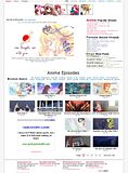
One more idea what to do with the white spot on the right side, where the preview text is right now: maybe we could add some cute anime character, that is doing an inviting gesture or something like that. You kill two flies with one hit that way!!!
we could use one of these Haruhi pictures, it would complement the Mikuru image we have on FTV as well:


What do you think?
I would:
1) Put a larger font size for the text, because it is very small and difficult to read
2) instead of the preview put: "last post by XX", but this is not necessary
3) I also agree the adds on the top are a disturbing element. Like Ausdorrent said, they would be better to the side or at the bottom.
4) I have an idea for the genres sections. The browse by genre is a great thing, but it is only for the current season, right? I think it would be a nice idea to set up a search engine for the archives as well, so that when people look for an older anime in a specific genre, they can find it. We get a lot of new members asking for a good harem/ecchi series or a romance series. They know the current season, but want to watch more and are looking for older series. I think that would be a nice feature.
One more idea what to do with the white spot on the right side, where the preview text is right now: maybe we could add some cute anime character, that is doing an inviting gesture or something like that. You kill two flies with one hit that way!!!
we could use one of these Haruhi pictures, it would complement the Mikuru image we have on FTV as well:


What do you think?
^ The genre page lists both the recent anime from the genre, as well as a list of everything in the archive that fits it.
For the picture, not sure where that'd fit... Personally, I like the already existing banner, and don't think that we need any more images on front page. The banner, of course, could be re-designed, but I would personally not be up for making something of comparable style and quality to what we have.
P.S. Oh and Haruhi isn't cute. I'd hate to see her every time I walk onto FTV. I may be hatin'/trollin' but whatever.